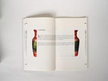
Designing Typesetting: A Guide to Creating Great Typography
In the world of digital media, typography is an essential element for enhancing user experience and visual communication. The way text is presented determines how effectively the content is conveyed to the reader. To create great typography, designers need to follow certain principles and guidelines. Here is a guide to designing typesetting that yields exceptional results.
1. Understanding Type Anatomy and Terminology
Before designing typography, it's important to understand the anatomy of type and the terminology used to describe it. Here are some of the key terms that you need to know:
- Baseline: The imaginary line on which the letters sit.
- X-height: The height of lowercase letters (excluding the ascenders and descenders).
- Ascender: The part of a character that extends above the x-height.
- Descender: The part of a character that extends below the baseline.
- Tracking: The amount of space between letters in a sentence or paragraph.
2. Choosing the Right Typeface and Font Size
The choice of typeface and font size can make or break the readability of the content. Here are some tips for selecting the right typeface and font size:
- Match the tone and style of the content: The typeface should complement the tone and style of the content. For example, a formal document would require a more traditional typeface like Times New Roman, while a modern website could use a sans-serif font.
- Consider the font size: The font size should be large enough to be easily legible but not so large that it takes up too much space.
- Choose a typeface with multiple variations: A typeface with variations like bold, italic, and condensed can help to create a hierarchy and make the content more engaging.
3. Focus on Alignment, Spacing, and Contrast
Following the right alignment, spacing, and contrast techniques is crucial to make typography more legible and visually appealing. Here are some guidelines:
- Alignment: Align text (left, center, justify, right) depending on the content and make sure there is consistency throughout the design.
- Spacing: Use adequate spacing between letters, words, and lines to avoid clutter and improve readability.
- Contrast: Use contrasting colors and font combinations to create a visual hierarchy that guides the reader's eyes through the content.
Good typography strikes a balance between functionality and aesthetics. A well-designed typography can help enhance the readability and impact of the content. By following the guidelines mentioned in this guide, designers can create typography that not only looks great but also reads well.


